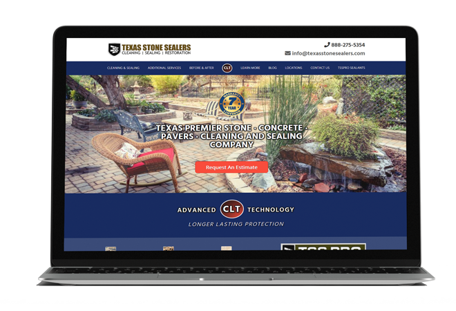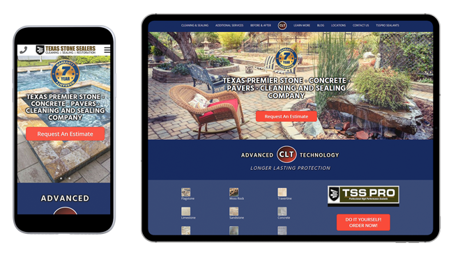
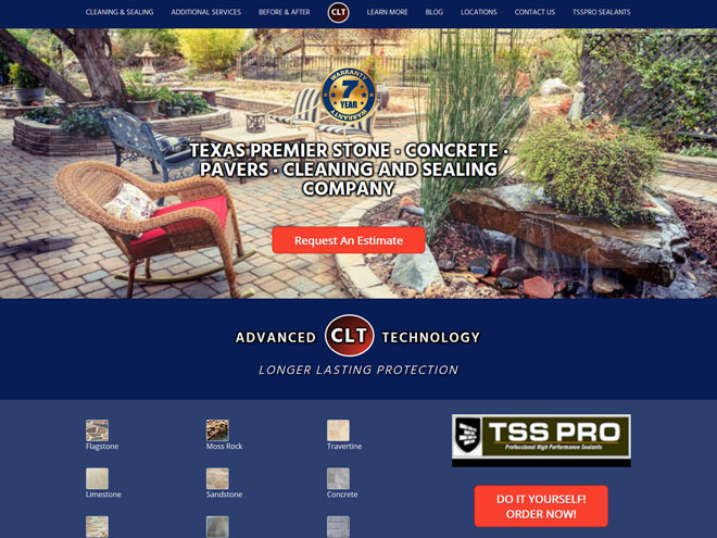
This medium-sized website was redesigned to maintain its recognizable visual style while enhancing its structure and flow. Services are clearly explained with simple steps, and location pages make it easy to check coverage, including the Houston headquarters and six locations in Texas. Contact options—for estimates, scheduling, or calls—are constantly visible on main pages, reducing the number of clicks needed from discovery to booking. The overall result is a smoother experience, from identifying a stone-care need to confirming an appointment, all while preserving the current brand appearance.
Under the hood, reusable components, lighter media, and clear typography improve readability and load feel, while event tracking on key actions confirms the path from interest to scheduled work. The result is a familiar-looking site that behaves faster, feels clearer, and scales cleanly as new markets or services are added.